
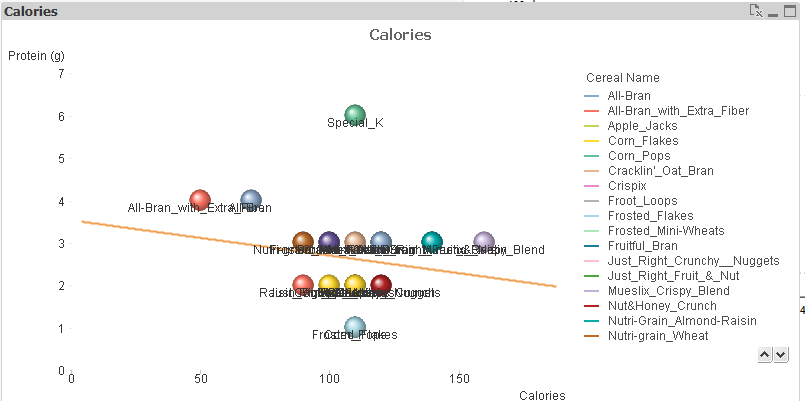
A request came in from a customer to build a Scatterplot within QlikView where displaying all labels on the plot was mandatory. However, depending on the data, it’s not difficult to get a very messy result, as labels can potentially overlap. To test this out I grabbed a set of data from here, and loaded it in. Sure enough on adding the default scatterplot from QlikView it looked pretty messy:
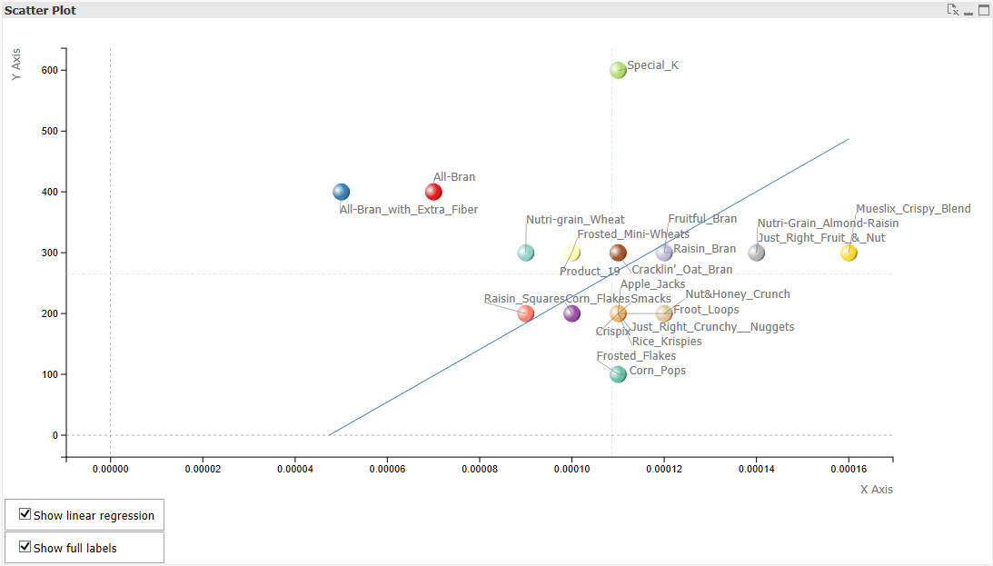
In order to deal with this I implemented an extension. Firstly I grabbed the D3 code from the link above and wired it in to an extension framework to get the basic scatterplot working. Next I looked into algorithms for spacing out the labels. The options out there are many and various, all relying on some kind of collision detection, but I had mixed results. This solution turned out to be incredibly slow, and only affected horizontal label placement (which isn’t very handy with these very wide labels). This one was the simplest and turned out to be both faster and cleaner than the above. However, best of all came from this paper on “simulated annealing”, the code for which can be found here. Massive thanks to Evan Wang for making his fabulous academic work publically available, The final result using this method can be seen here:
I added a whole bunch of parameterisation, as QlikView extensions lack any kind of interactivity by default. As this uses D3 there is also the option of using transitions to move the labels across the page, which looks pretty slick.